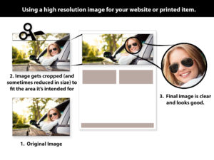
How do you determine what pictures will work and what won’t?
We sometimes have issues explaining what it means when we ask for high resolution images for a graphic design or website design project. Depending on the project, it might end up with “just send me the largest picture you have”, and we try to do our best. That’s not the best way to do it, though, so I put together an informative page explaining how your image is going to be applied to your design project.
You will learn about things like pixels and how they effect your images clarity. In a nutshell: not enough pixels in the space you have for the image means a grainy, blurry or distorted picture. You can see an example of what I’m talking about in the tutorial.
I think my images are high resolution, but my designer says it won’t fit!
The area where the image will ultimately end up is the key to the resolution needed. It’s also going to determine how your photo should be composed. That’s explained in a little more detail in the tutorial.
It’s not all about what is in your picture.
The way you take the picture is also very important. Creating balance, or offsetting your subject, allows for text areas, buttons, etc. to be used on top of the picture. This creates a very dramatic visual for your visitor, and be effective in creating just the right emotion to get them to act.
Discuss the project’s graphic needs with your designer.
If your designer has given you specific instructions, regarding pixel widths, height, resolution, etc. then you might not need this. Then again…it could still be useful in explaining what that pixels are going to do in the hands of your designer.
Still have questions?
If the tutorial leaves you wondering still, please feel free to ask me more. Questions always help us all. Please comment below, on the tutorial, or via our contact form.
The tutorial on “Selecting images for your website or printed materials” can be found here.

